Logo Design Process Explained: From Concept to Final Design
A logo is often the first visual interaction someone has with a brand. It’s a small graphic, but it carries a large responsibility: communicating identity, values, and personality in a single mark. Because of this, effective logo design is not just about aesthetics—it is a structured creative process that blends research, strategy, creativity, and refinement.
Below is a step-by-step explanation of how a professional logo typically goes from an initial idea to a polished final design.
1. Understanding the Brand and Project Brief
Every successful logo begins with understanding. Before any sketches are made, designers spend time learning about the brand. This usually starts with a project brief, which may come from the client or be developed through interviews and discussions.
Key questions include:
- What does the company do?
- Who is the target audience?
- What values or personality should the brand reflect?
- Who are the competitors?
- Where will the logo be used (website, packaging, signage, etc.)?
This stage is crucial because a logo is not designed in isolation. A playful logo for a children’s toy brand, for example, will look very different from a minimalist logo for a financial institution. Understanding context ensures the design is meaningful rather than just visually appealing.
2. Research and Inspiration
Once the brand is clearly understood, designers move into research. This includes studying the industry, competitors, and visual trends—but not copying them. The goal is to understand what already exists so the new design can stand out.
Designers often create mood boards, collecting imagery, typography styles, colors, and textures that reflect the brand’s personality. They also explore symbolic references that might relate to the business name or mission.
For example, a sustainable brand might inspire natural textures, earthy colors, and organic shapes. A tech company might lean toward geometric forms, clean lines, and modern typography.
This stage helps set a creative direction and prevents the design from feeling random or disconnected.
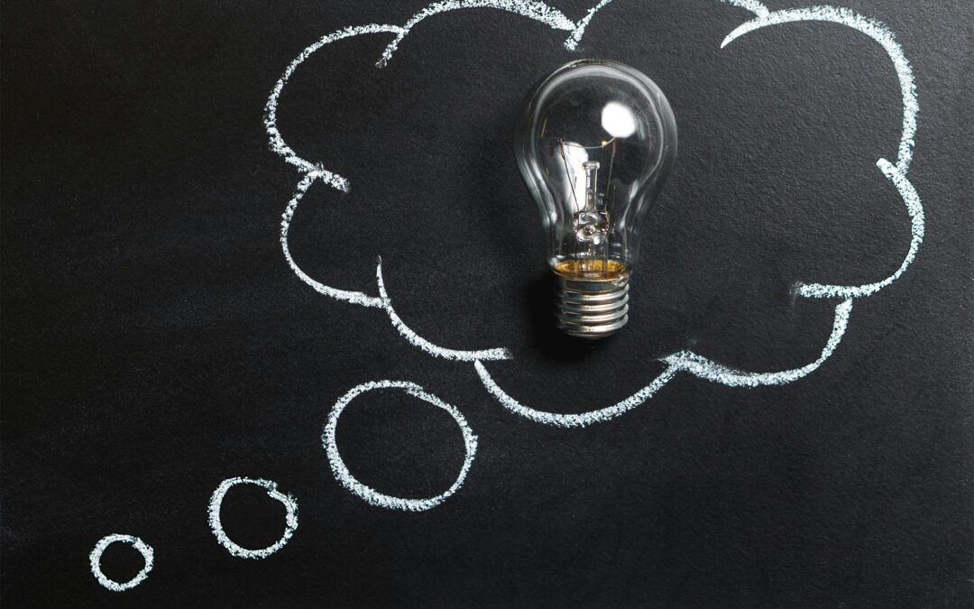
3. Brainstorming and Concept Development
With research complete, designers begin generating ideas. This is the most exploratory phase of the process. It often involves sketching many rough concepts quickly without worrying about perfection.
Common techniques include:
- Word association (linking ideas to brand values)
- Visual metaphors (turning concepts into symbols)
- Typography experimentation
- Shape exploration
At this stage, quantity matters more than quality. Designers may produce dozens of sketches before narrowing them down. Some ideas might be literal representations, while others are abstract interpretations of the brand.
For instance, a logistics company might explore arrows, paths, or interconnected shapes to represent movement and efficiency.
4. Sketching and Refinement
After brainstorming, the strongest concepts are selected and refined through more detailed sketches. This is where rough ideas begin to take clearer form.
Designers experiment with proportions, spacing, and composition. They test whether the logo works as a symbol, a wordmark, or a combination of both. Typography choices also become more intentional, as type plays a major role in how a logo feels—modern, traditional, bold, or elegant.
Sketching is still often done by hand or digitally using simple tools. The goal is not perfection but clarity of concept. By the end of this stage, a few strong directions usually emerge.
5. Digital Development
Once the best concepts are selected, they are transferred into digital design software such as Adobe Illustrator or similar vector-based tools. This step transforms rough sketches into precise, scalable artwork.
Vector design is essential because logos must be usable at any size—from a small app icon to a large billboard—without losing quality.
During digital development, designers:
- Clean up shapes and lines
- Refine proportions
- Experiment with spacing and alignment
- Test different typography options
- Adjust balance and symmetry
This stage often involves multiple variations of the same concept. Small changes can significantly impact how the logo feels.
6. Color Exploration
Color is a powerful communication tool in logo design. It influences emotion, perception, and brand recognition. Once a strong black-and-white version of the logo is finalized, color exploration begins.
Designers consider:
- Brand personality (trustworthy, energetic, luxurious, etc.)
- Cultural meanings of colors
- Industry expectations
- Accessibility and contrast
For example:
- Blue often represents trust and professionalism
- Green is associated with nature and sustainability
- Red conveys energy and urgency
- Black suggests luxury and sophistication
However, many strong logos are also designed to work in monochrome first, ensuring they remain effective without relying on color.
7. Typography Selection
If the logo includes text, typography becomes a key element. The font must align with the brand’s identity and work harmoniously with any symbol.
Designers evaluate:
- Serif vs sans-serif styles
- Weight and spacing
- Custom lettering possibilities
- Readability at different sizes
Sometimes, designers modify existing fonts or create custom letterforms to ensure uniqueness. Even small adjustments—such as altering the curve of a letter or spacing between characters—can significantly improve the final result.
8. Presentation and Feedback
Once a few strong logo options are developed, they are presented to the client or stakeholders. Presentation is not just about showing the logo—it’s about explaining the thinking behind it.
Designers typically include:
- Concept explanation
- How it connects to brand values
- Usage examples (business cards, websites, packaging)
- Different variations (horizontal, vertical, icon-only)
Feedback is then collected. This stage may involve revisions, combining elements from different concepts, or refining details based on input.
9. Refinement and Final Adjustments
Based on feedback, the selected design is refined further. This might include adjusting spacing, simplifying shapes, improving legibility, or fine-tuning color tones.
Attention to detail is critical here. Even small inconsistencies can affect how professional and balanced the logo appears.
Designers also test the logo in real-world scenarios to ensure it works across different platforms and backgrounds.
10. Final Delivery and Brand Assets
Once approved, the logo is finalized and exported in multiple formats for different uses. These typically include:
- Vector files (AI, EPS, SVG)
- Raster files (PNG, JPG)
- Black, white, and color versions
- Horizontal and vertical layouts
Often, designers also create a simple brand guide outlining how the logo should be used, including spacing rules, color codes, and incorrect usage examples.
Conclusion
The logo design process is a structured journey that transforms abstract ideas into a meaningful visual identity. From understanding the brand to final delivery, each stage plays a vital role in ensuring the logo is not only visually appealing but also strategically effective.
A strong logo is not created by chance—it is the result of thoughtful research, creative exploration, and careful refinement. When done well, it becomes a lasting symbol that represents a brand’s identity for years to come.